Web UI/UX Design
E-OKKPD Website Redesign
This redesign project aimed to improve the usability of the E-OKKPD website—an online platform for food safety services and testing applications. The initiative focused on addressing user pain points and enhancing the digital experience for food business owners and government staff.
Year :
2025
Industry :
Public Sector / Government
Client :
Dinas Ketahanan Pangan Provinsi Jawa Tengah
Project Duration :
6 month

Understanding the User Experience
Initial usability testing using the SUS method scored the existing site at 57.93 (“marginally low”). Through surveys and interviews with 52 users, both food entrepreneurs and internal staff, I uncovered navigation issues, unclear menu labels, and inconsistent visuals.
Analyzing Needs and Pain Points
Observation and contextual inquiries revealed users often got lost in the service request flow. Content structure lacked clarity, which hindered users’ ability to complete important tasks like submitting applications or tracking requests. These insights informed the ideation stage.
Ideation & Wireframing
I translated the findings into improved site architecture and sketched out key user flows. Wireframes were developed in Figma, emphasizing accessibility, clear labeling, and visual hierarchy. Each wireframe was reviewed iteratively to ensure alignment with user expectations.
High-Fidelity Prototyping
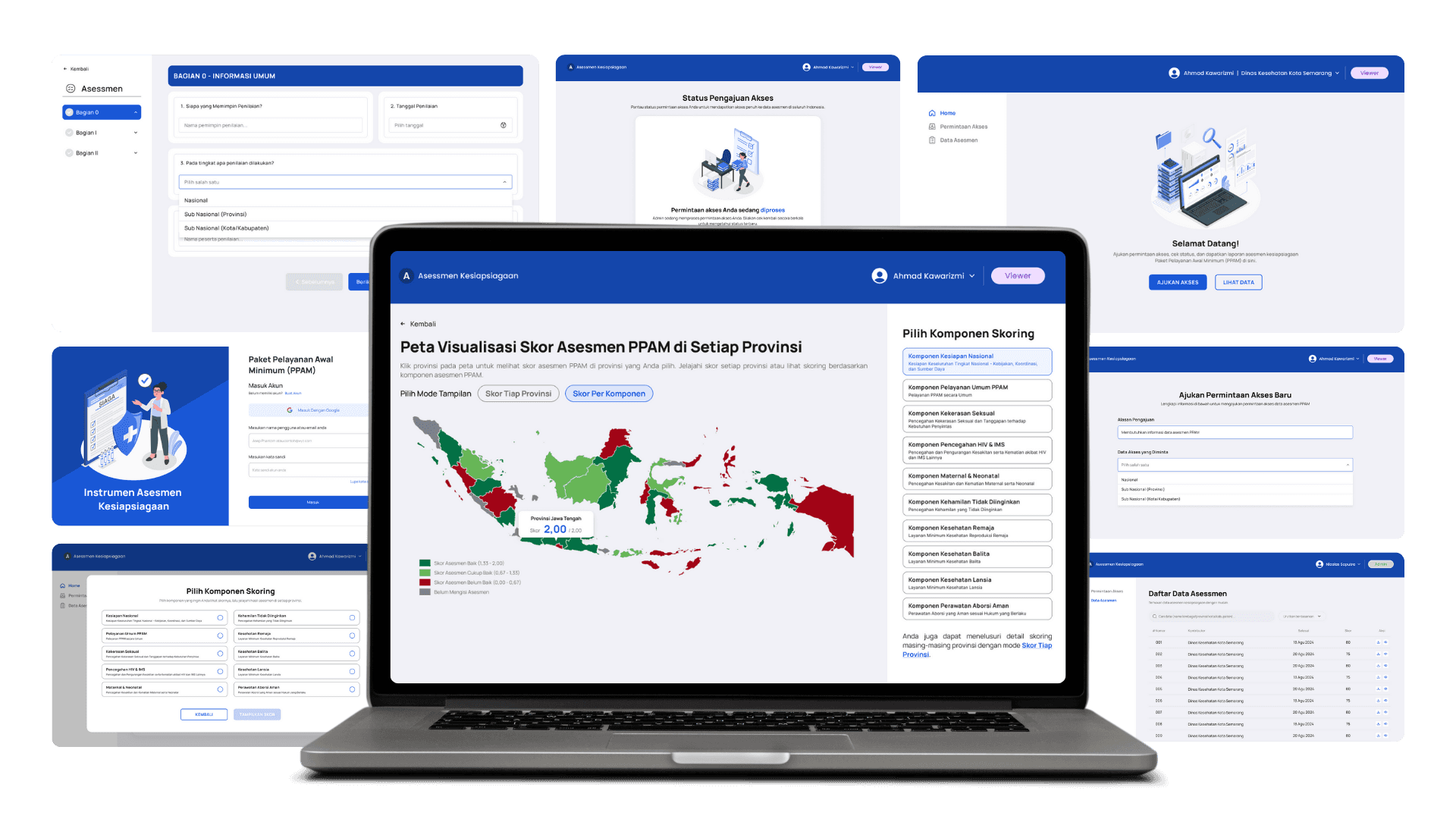
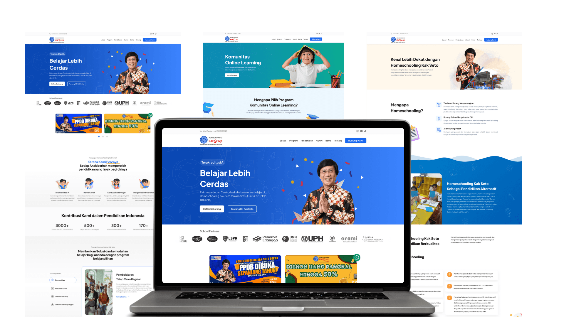
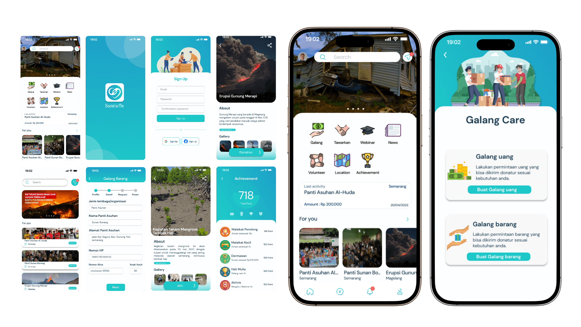
The final design was transformed into an interactive prototype. The visual style was adapted to match institutional branding while enhancing clarity and responsiveness. Tools used included Figma and Notion to manage progress and documentation.
More Projects


Web UI/UX Design
E-OKKPD Website Redesign
This redesign project aimed to improve the usability of the E-OKKPD website—an online platform for food safety services and testing applications. The initiative focused on addressing user pain points and enhancing the digital experience for food business owners and government staff.
Year :
2025
Industry :
Public Sector / Government
Client :
Dinas Ketahanan Pangan Provinsi Jawa Tengah
Project Duration :
6 month
Understanding the User Experience
Initial usability testing using the SUS method scored the existing site at 57.93 (“marginally low”). Through surveys and interviews with 52 users, both food entrepreneurs and internal staff, I uncovered navigation issues, unclear menu labels, and inconsistent visuals.
Analyzing Needs and Pain Points
Observation and contextual inquiries revealed users often got lost in the service request flow. Content structure lacked clarity, which hindered users’ ability to complete important tasks like submitting applications or tracking requests. These insights informed the ideation stage.
Ideation & Wireframing
I translated the findings into improved site architecture and sketched out key user flows. Wireframes were developed in Figma, emphasizing accessibility, clear labeling, and visual hierarchy. Each wireframe was reviewed iteratively to ensure alignment with user expectations.
High-Fidelity Prototyping
The final design was transformed into an interactive prototype. The visual style was adapted to match institutional branding while enhancing clarity and responsiveness. Tools used included Figma and Notion to manage progress and documentation.
More Projects
Web UI/UX Design
E-OKKPD Website Redesign
This redesign project aimed to improve the usability of the E-OKKPD website—an online platform for food safety services and testing applications. The initiative focused on addressing user pain points and enhancing the digital experience for food business owners and government staff.
Year :
2025
Industry :
Public Sector / Government
Client :
Dinas Ketahanan Pangan Provinsi Jawa Tengah
Project Duration :
6 month
Understanding the User Experience
Initial usability testing using the SUS method scored the existing site at 57.93 (“marginally low”). Through surveys and interviews with 52 users, both food entrepreneurs and internal staff, I uncovered navigation issues, unclear menu labels, and inconsistent visuals.
Analyzing Needs and Pain Points
Observation and contextual inquiries revealed users often got lost in the service request flow. Content structure lacked clarity, which hindered users’ ability to complete important tasks like submitting applications or tracking requests. These insights informed the ideation stage.
Ideation & Wireframing
I translated the findings into improved site architecture and sketched out key user flows. Wireframes were developed in Figma, emphasizing accessibility, clear labeling, and visual hierarchy. Each wireframe was reviewed iteratively to ensure alignment with user expectations.
High-Fidelity Prototyping
The final design was transformed into an interactive prototype. The visual style was adapted to match institutional branding while enhancing clarity and responsiveness. Tools used included Figma and Notion to manage progress and documentation.